I find the idea of choosing a colour palette quite daunting. Whilst I can mix any colour with paint and build any hue in layers of thread, choosing a palette feels difficult.
For a recent Textiles MA project, I was asked to go on a colour walk, taking a sketchbook and camera to record my experiences and observation of colour. What did I notice first, what took more time to notice, and did I notice anything that I might usually overlook?

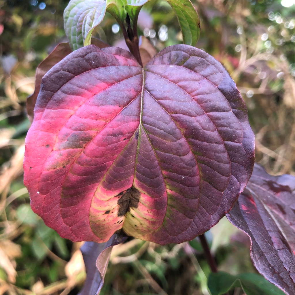
The first colour palette came from decaying autumn leaves showing beautiful hues of pink, purple and orange set against deep greys. I decided that I couldn’t work with this palette because it felt too pretty and decorative. It was a colour scheme that I associated with a different period in my life, before a family trauma.
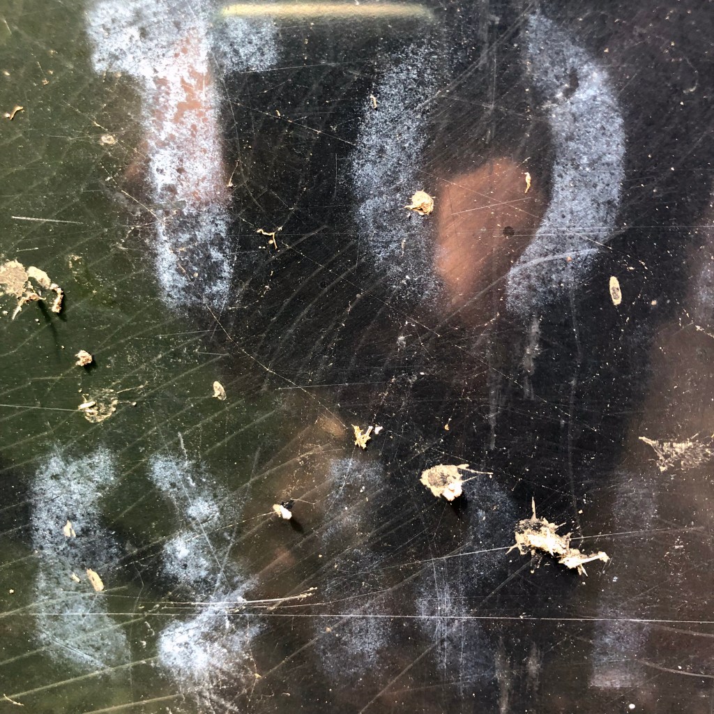
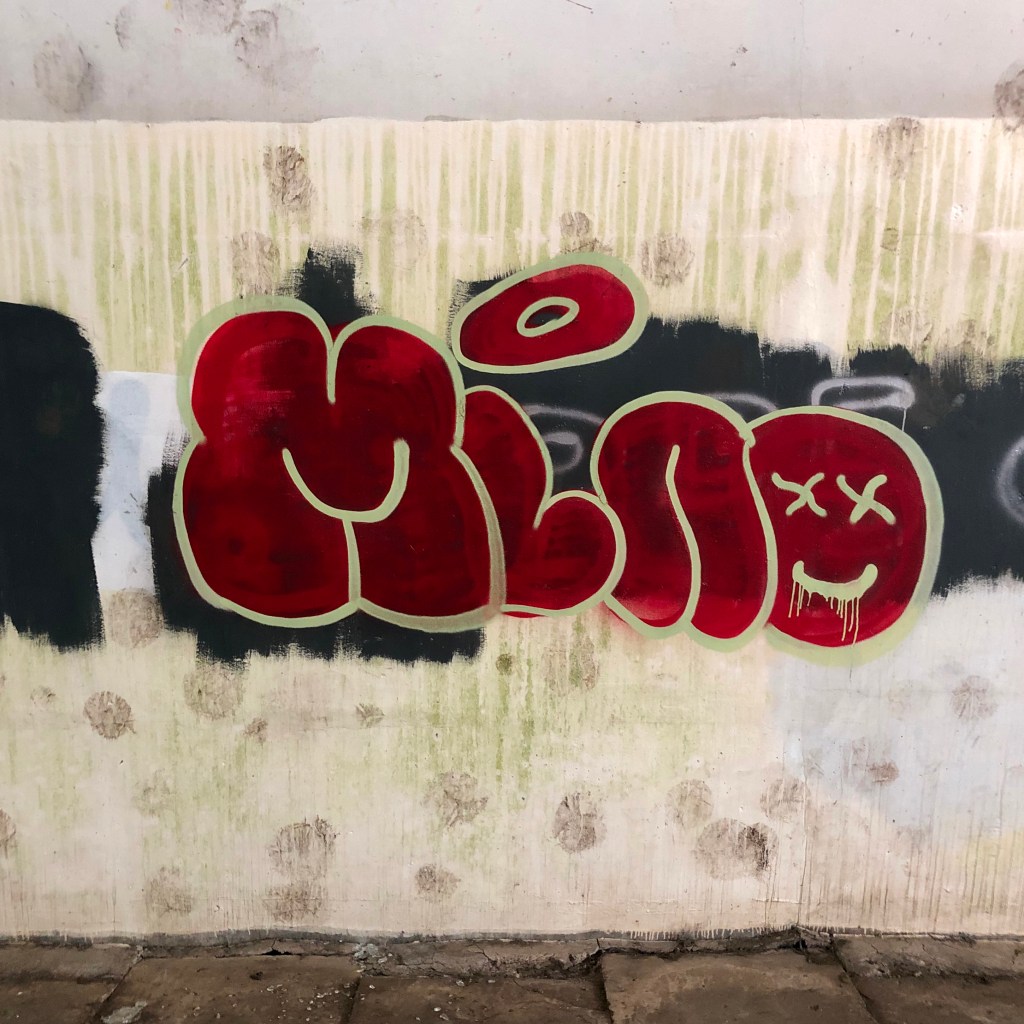
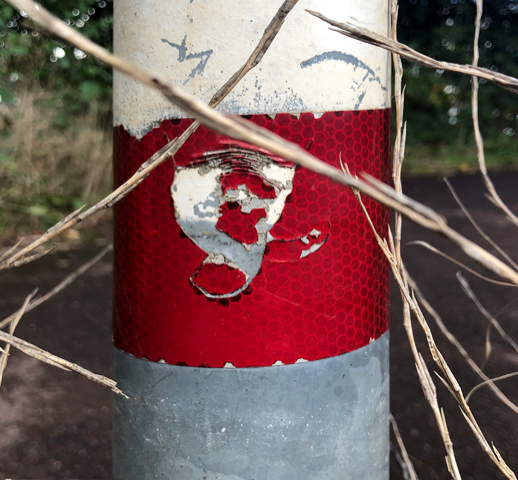
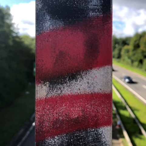
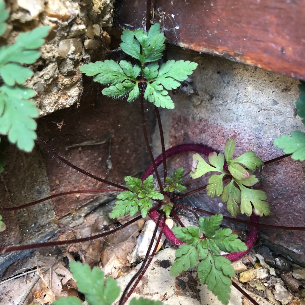
The second palette took slightly more time to notice because it belonged to damaged street furniture. The objects were very ordinary, dirty, and neglected, surprisingly, this felt more agreeable. I work with thread and like to draw images that wouldn’t normally be depicted in stitch.
Colours have their own identity, however the close proximity of another colour will have an effect on what the viewer sees. To explore this, I decided to make some small samples based on Joseph Albers Colour Theory. I used coloured paper, found fabric and free machine embroidery to make some simple experiments with both an analogous and complimentary colour scheme.

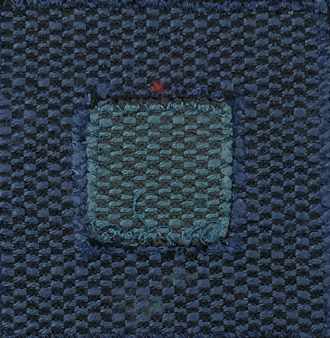
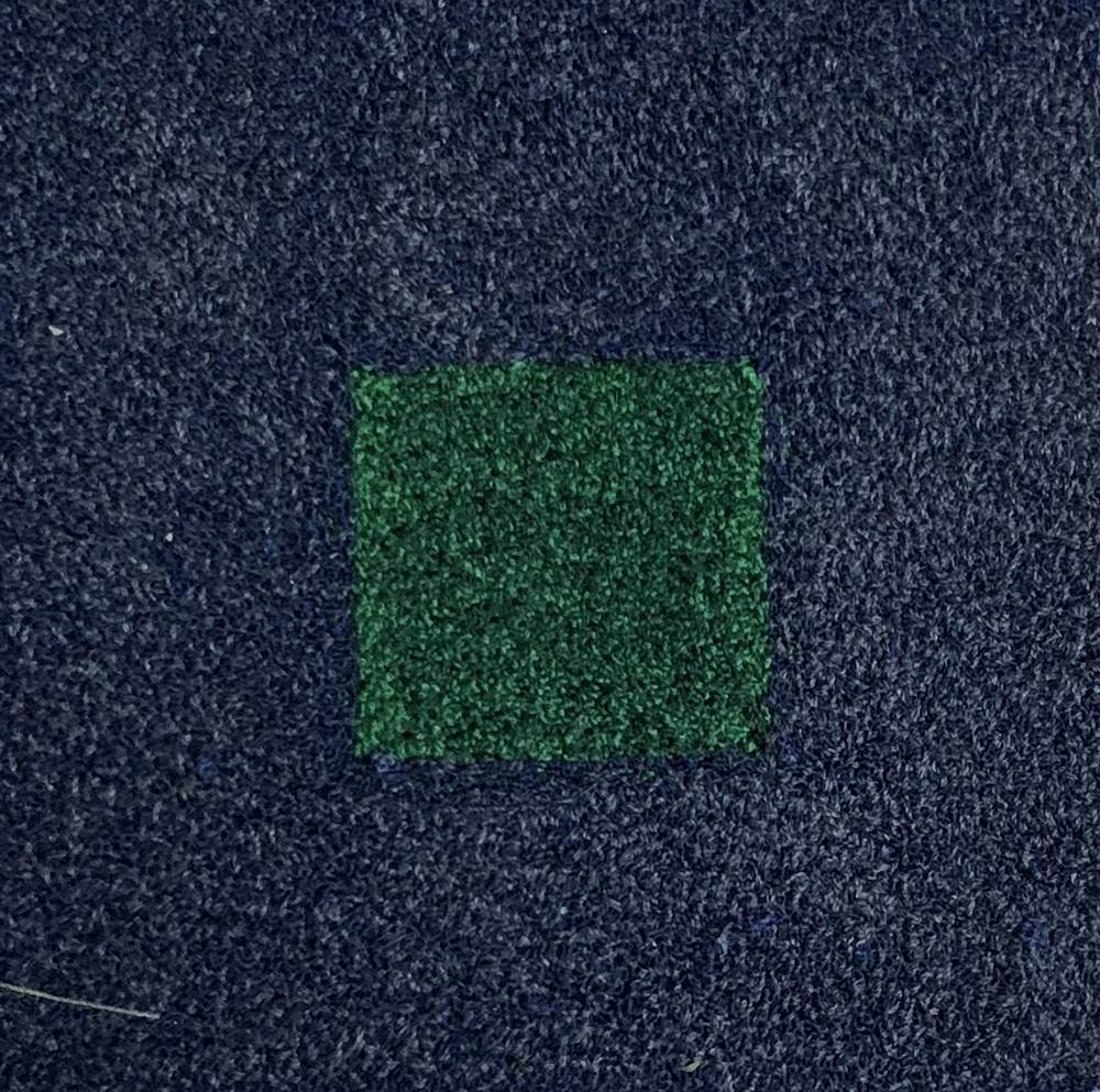


In the analogous colour scheme, the green became more luminous whereas in the complimentary, it became dulled. Red and green are opposite each other on the colour wheel and when mixed will make black.
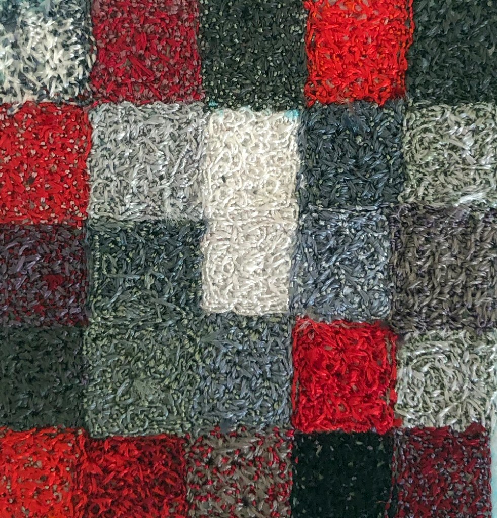
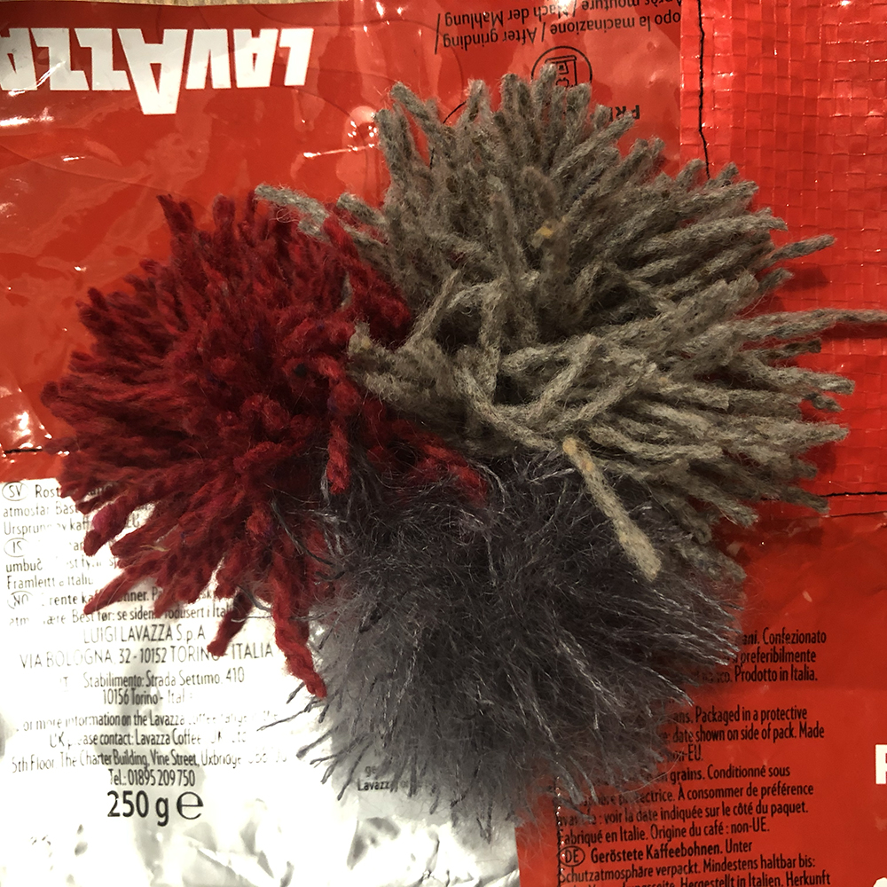
To continue the experiment, I made some yarn windings varying the quantity and placement of each colour as well as changing the background card from light to dark.


I tried a few other experiments focusing on the colour red and varying the amount and placement of the colour. Red is a powerful colour and a little goes a long way.

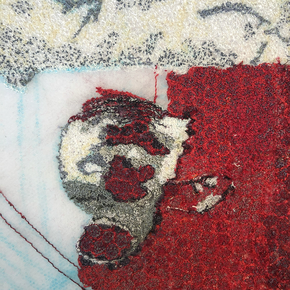
Returning to the images of the damaged street furniture I started to make a small free machine embroidered drawing. However, the colour red felt as if it needed a different approach.


Using found materials and threads, I made a series of drawings working with more speed and freedom. The effect was both fun and surprising.
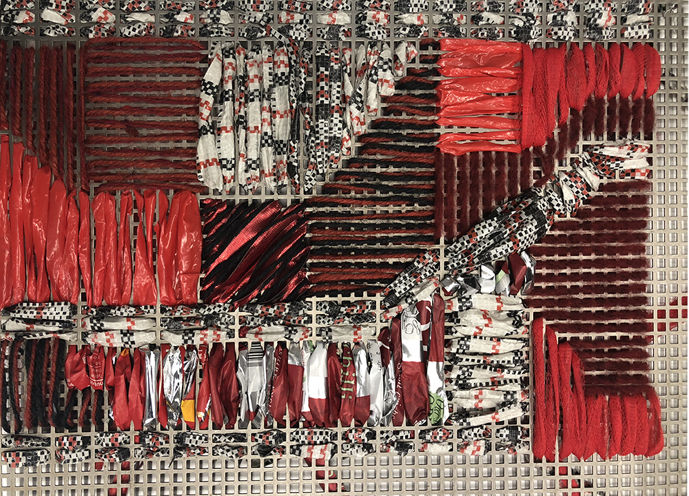
The last experiment involved a trip to the metal work department where I found a piece of discarded perforated sheet metal. I used what was left of my found materials and made a sampler containing crisp packets, laundry bags, plastic carrier bags, garden twine and left over ribbon.
This was my first project on my MA, I can’t wait to see where other projects will lead. You can follow my progression on @julieheatonartist on Instagram, and look out for further blogposts here on seamcollective.org.
Julie Heaton
